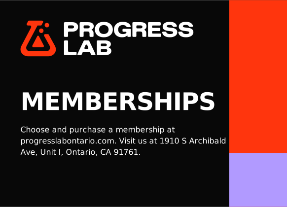
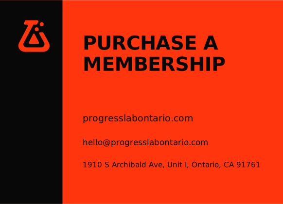
Make the next step clear
Give each message one job. Name the action and put it where people can find it.

The Progress Lab identity, with artwork, examples and files for everyday use.
Choose what you’re making. Follow the example and use the supplied files.
How we train and show up for each other.
Coach-led training with people who help each other make progress.
Give people a place to train hard and feel supported.
People of all training levels who want coaching, encouragement and a challenge.
Give each message one job. Name the action and put it where people can find it.
Show a coaching cue, shared effort or encouragement between sets.
Offer support and a challenge without pressure or judgment.
Use actual classes, people and details. Leave out promises we cannot support.
Progress Lab is the brand. Use Ontario for the current location, directions and city-specific information.
Use the supplied artwork. Choose the full logo when people need to see the name.

At least one quarter of the symbol height on every side of the full lockup. The symbol height is H; minimum clear space is H/4.
Align to the layout edge with clear space intact. Use one primary mark per face. Put partner marks outside its clear space; preserve each partner’s own rules.

Minimums are starting sizes. Proof the smallest bubbles and letter openings in the final medium.
City tags identify a location. They do not limit who belongs. A “lockup” is the logo and city tag kept together.
Use the main logo for the website and messages from Progress Lab as a whole.

Use ONT on local apparel, gear and event material when the Ontario connection is clear.

Use Ontario for signs and local information when the full city name helps. Give the full address separately for directions.
Use the supplied logo and city tag together. Keep their lettering, size and spacing unchanged. Never add a city to the flask alone.
Use one logo per placement. Do not combine ONT and Ontario or repeat the city below the logo.
Leave at least H/4 around the whole logo, including the tag. H is the flask’s full height, including its bubbles.
Start at 200 px wide on screen or 45 mm in print. Check the city at its final size. If it is hard to read, use the main logo.
Use the supplied ONT or Ontario file. Ask Progress Lab for artwork before adding another city.
Use the flask alone when the name Progress Lab is already nearby, such as a social profile, website or branded shirt. Otherwise, use the full logo.


Leave at least one-quarter of the flask’s height clear on every side, including inside an avatar crop.
Minimum flask height: 24 px on screen / 6 mm in print, plus clear space. Use a 36 px or larger square for a 24 px-high symbol.
If a platform forces a 16 px website icon, inspect the actual export separately. The bubbles must remain distinct; this is smaller than the usual minimum.
Use the supplied orange, black, white or violet flask on a plain, contrasting background. Use black or white for very small icons.
Keep the flask upright and complete. Do not stretch, crop, redraw or add effects. City tags belong to the full logo.
Use PNG for email, slides and everyday apps. Use SVG for editing and print. Keep the original proportions.
Black and white hold the system together. Orange leads. Violet supports. These four colors define the identity.
Primary text, dark fields and one-color artwork
Open space and reversed text
Primary brand accent; signature flask and key actions
Secondary accent; supporting panels, details and apparel options
Starting point across a composition, not a quota. Apparel can use a violet blank. Keep the primary logo orange.
White on orange passes the large-text minimum, but fails normal text. White on violet fails both. Use black text on violet.
Gray surfaces, secondary text and error colors belong to the interface system. They support usability and are not additional brand accents.
Print: Digital masters use sRGB. Convert with the printer’s ICC profile for the stock and process. No CMYK recipe or Pantone match is approved. Require a physical proof; screens cannot certify ink, dye or thread.
Diatype Extended brings physical force to short statements. Diatype Plus keeps the instructions clear. The contrast should feel like a coach calling the room to attention, then explaining the work.
Aa Bb Cc 012345
Set display headlines in ABC Diatype Extended Ultra, in ALL CAPS. Keep them short and break lines at natural phrases. Use sentence case for body copy, practical subheadings, buttons, navigation and service email headings. Preserve the supplied artwork when the words are part of the logo.
Aa Bb Cc 012345
Reading text, navigation, instructions and details. Use regular weight for sustained reading and medium or bold for controls.
Scale headlines to fit the screen. Keep text lines at 55–70 characters and letter spacing no tighter than −0.02em.
Use Arial, Helvetica, sans-serif. Email templates must stay readable without custom fonts.
Line things up. Give the message room. Use the flask as the signature.
12 columns
24 px gutters
64 px margins
Use the 12-column desktop grid and four-column mobile grid. Anchor type, marks, and actions to shared edges.
Use the exact flask as a signature, navigation mark, or small brand detail. Keep the bubbles and silhouette intact.
Orange directs attention. Violet adds a supporting beat. Large black and white fields do most of the work.
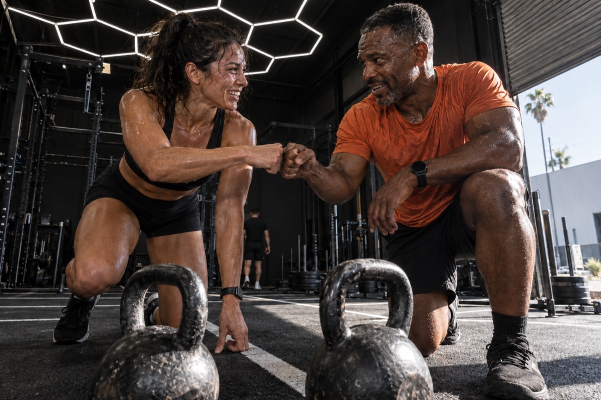
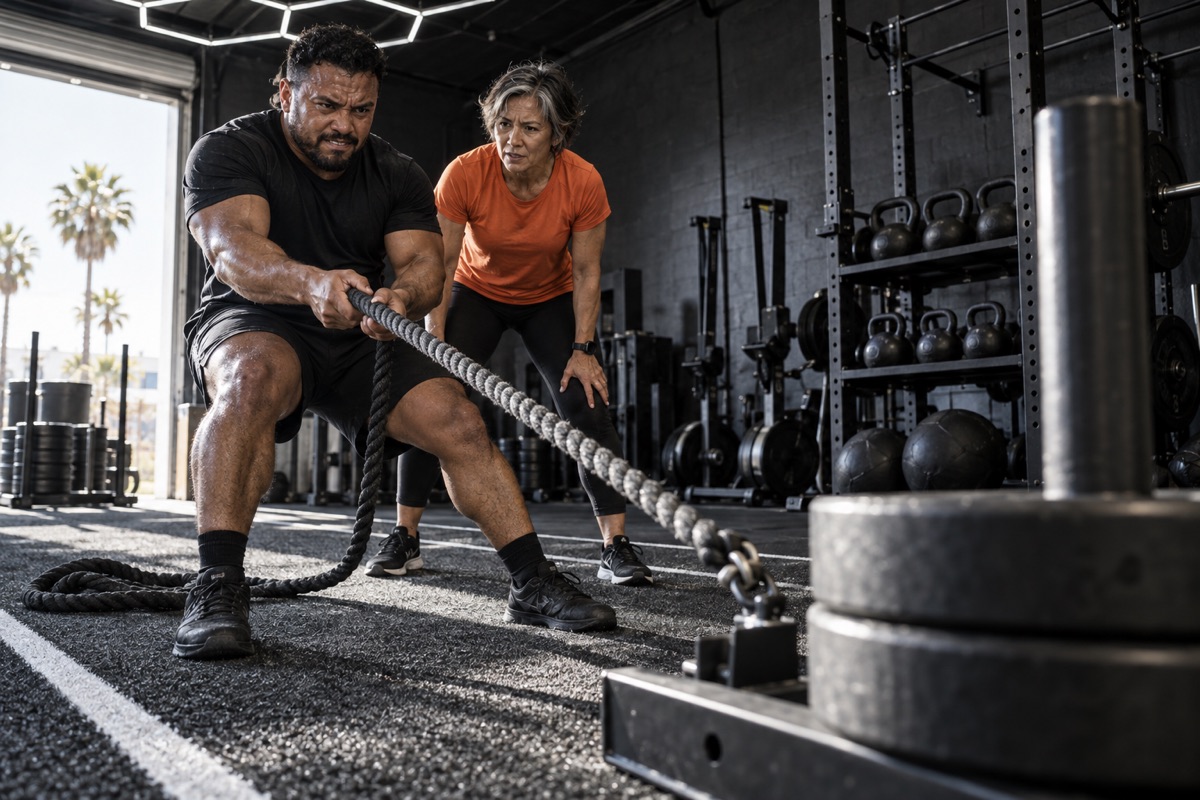
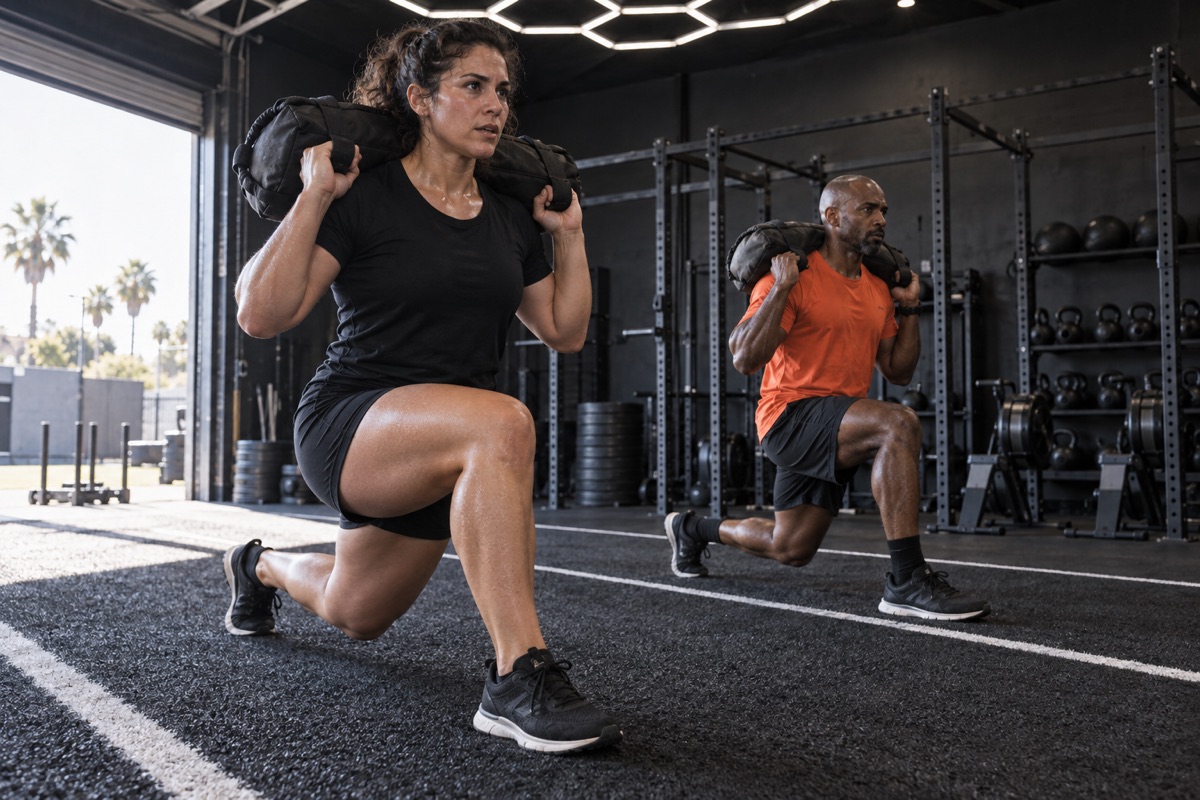
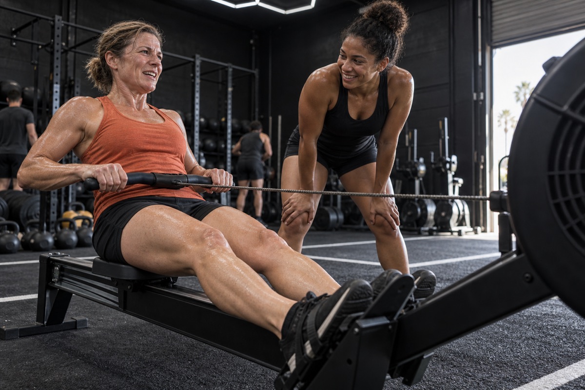
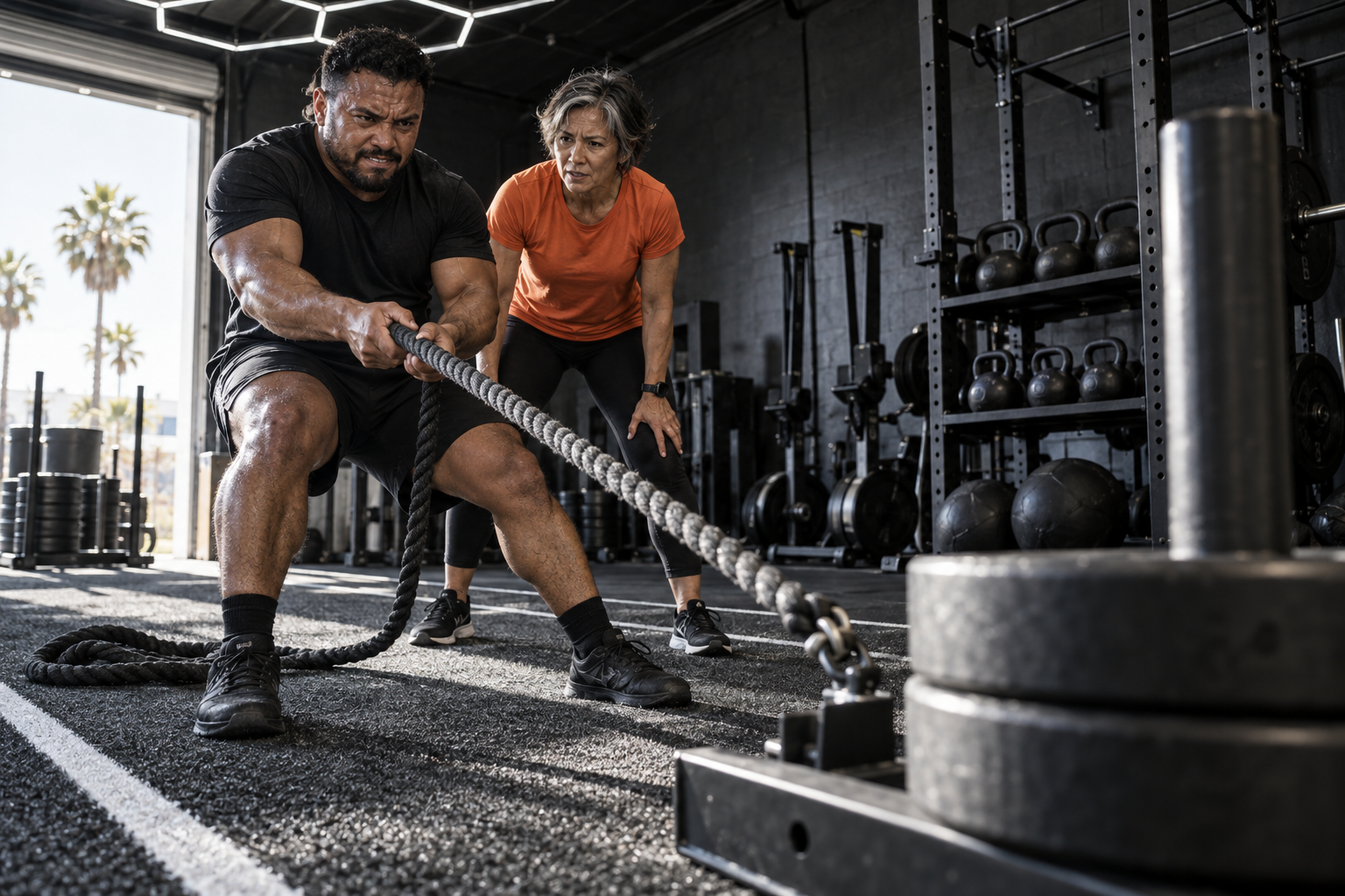
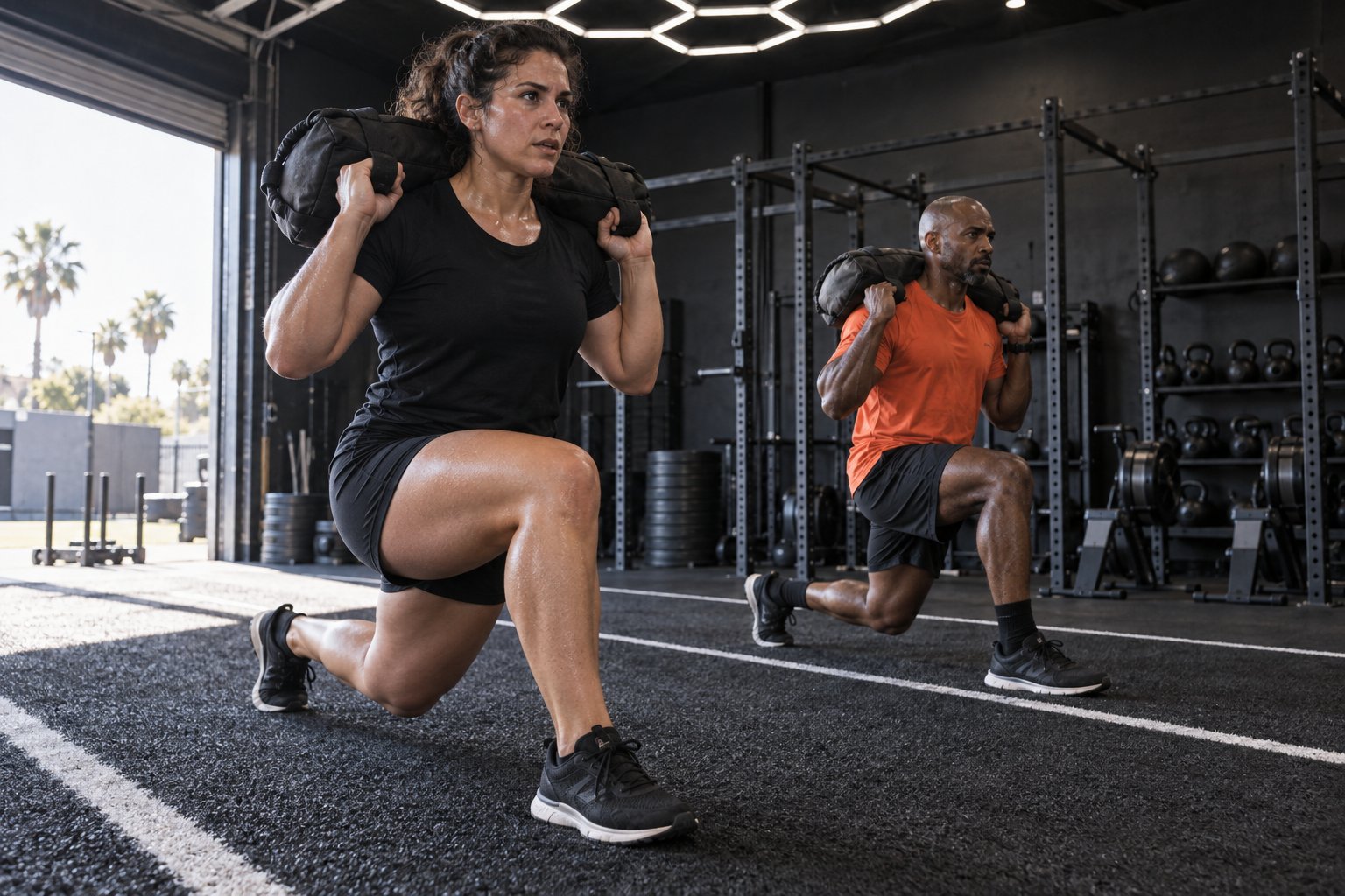
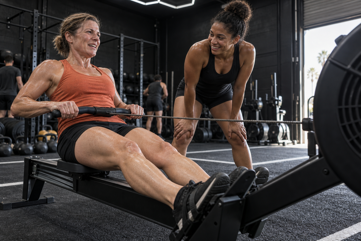
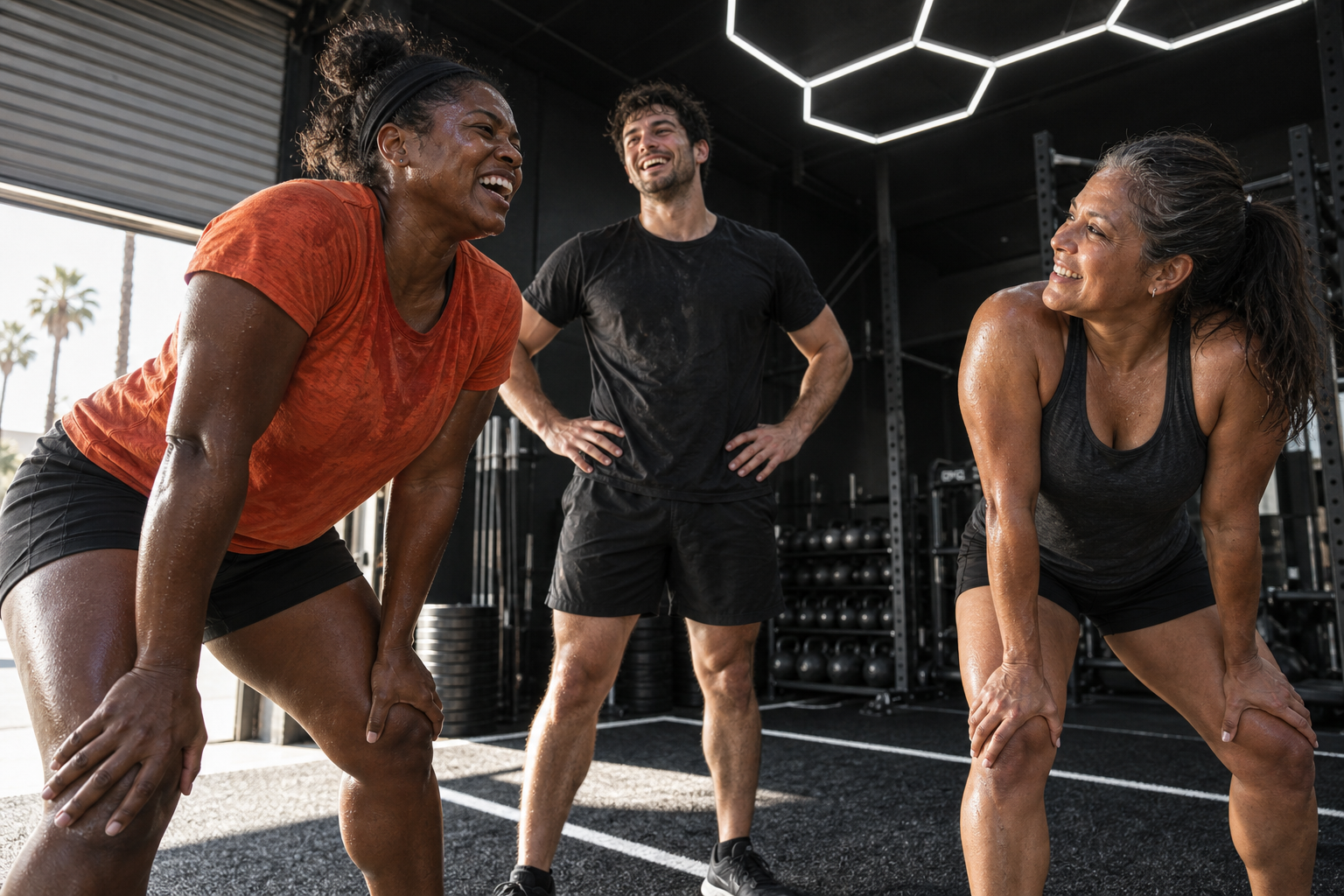
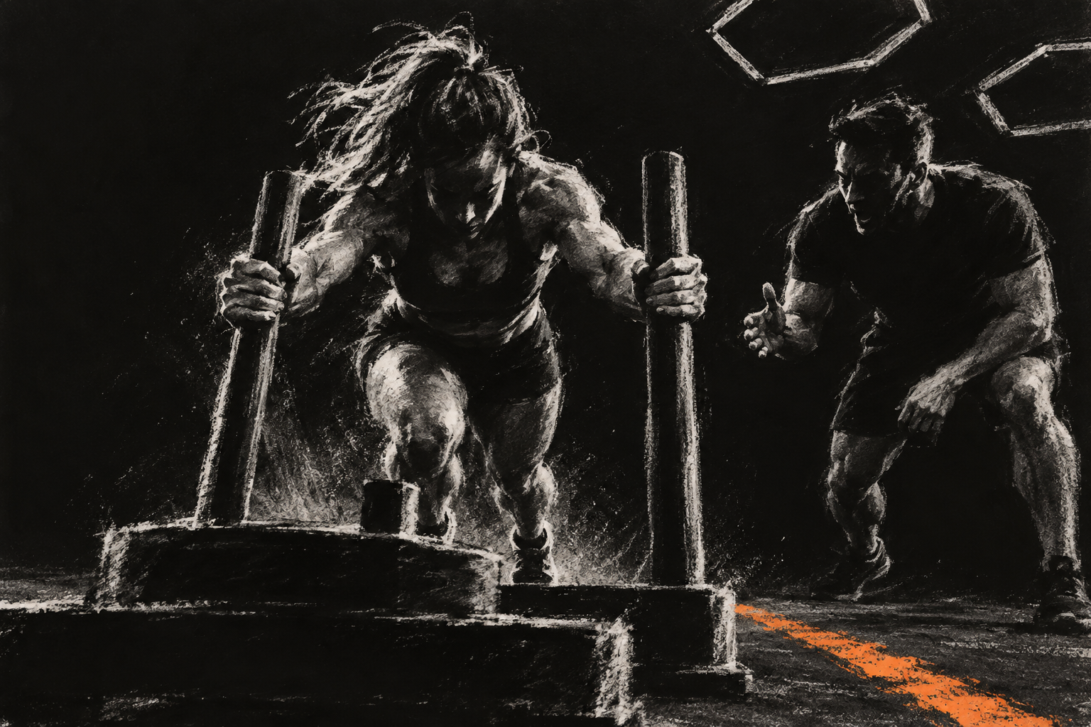
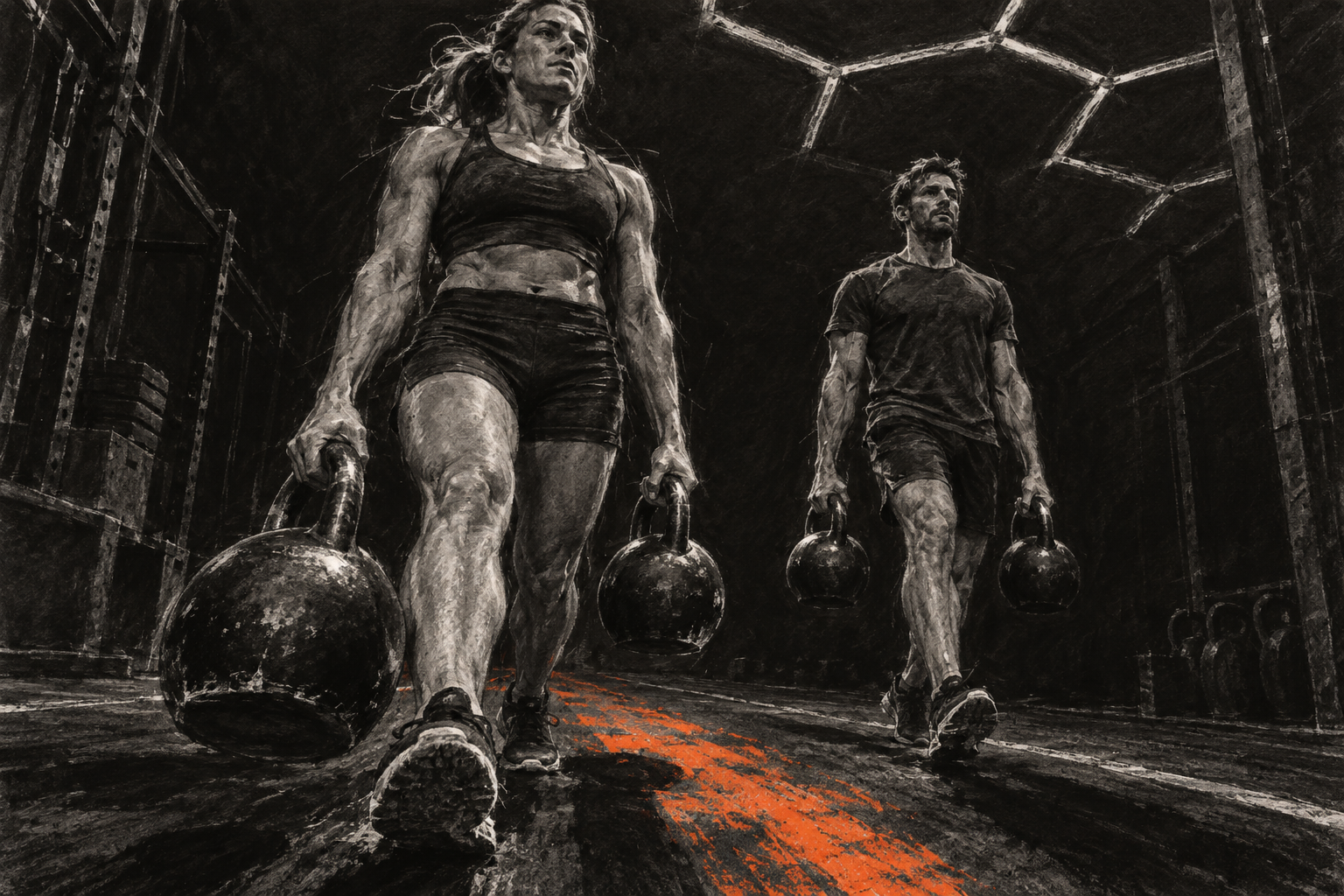
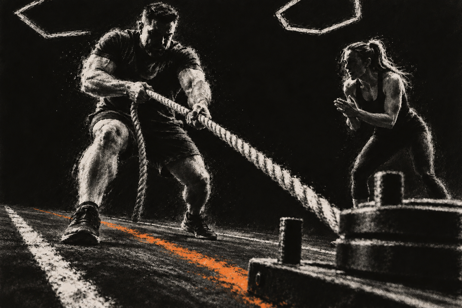
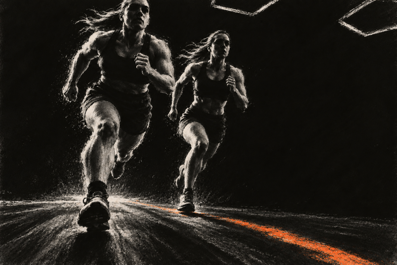
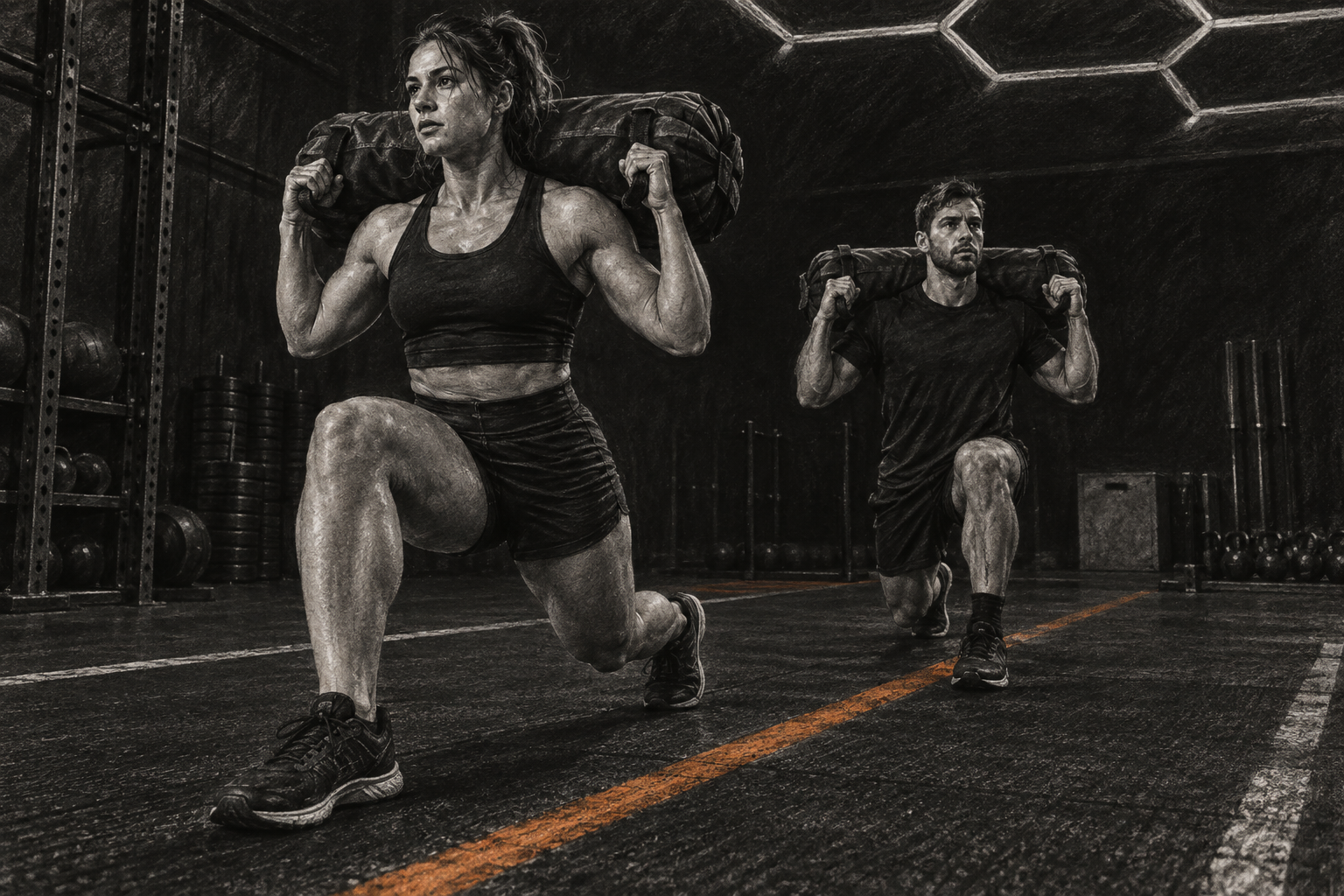
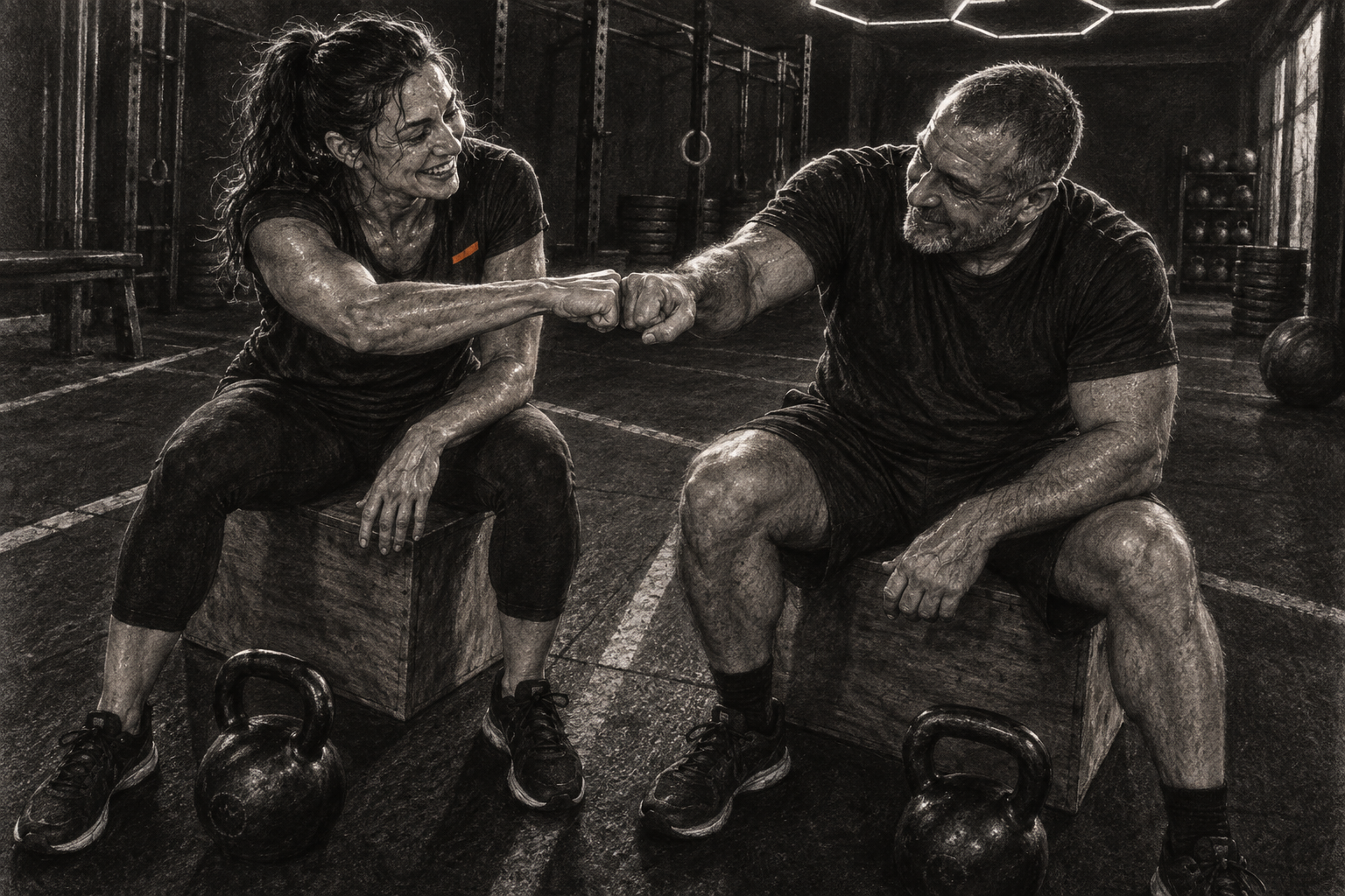
Show the work and the people behind it. Use hard light, deep blacks and close framing.
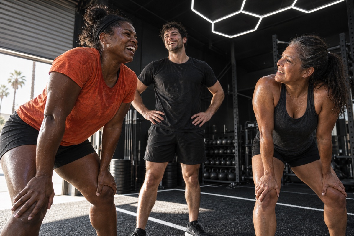
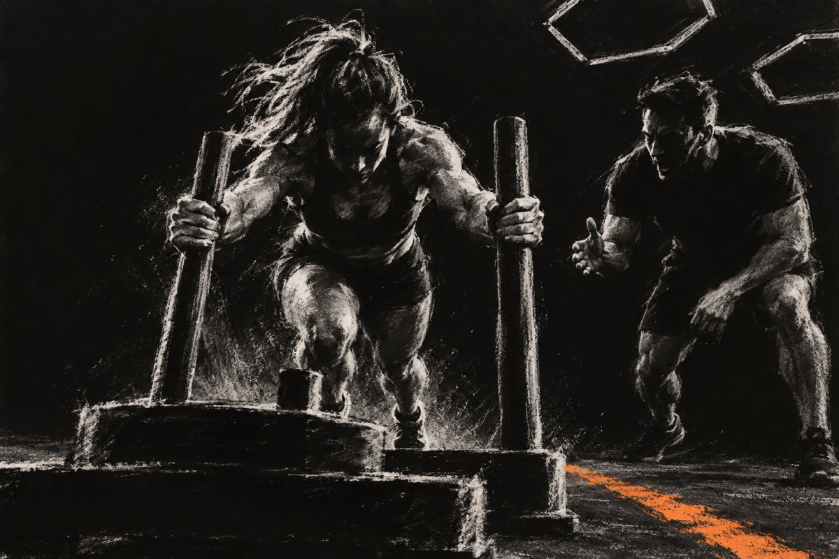
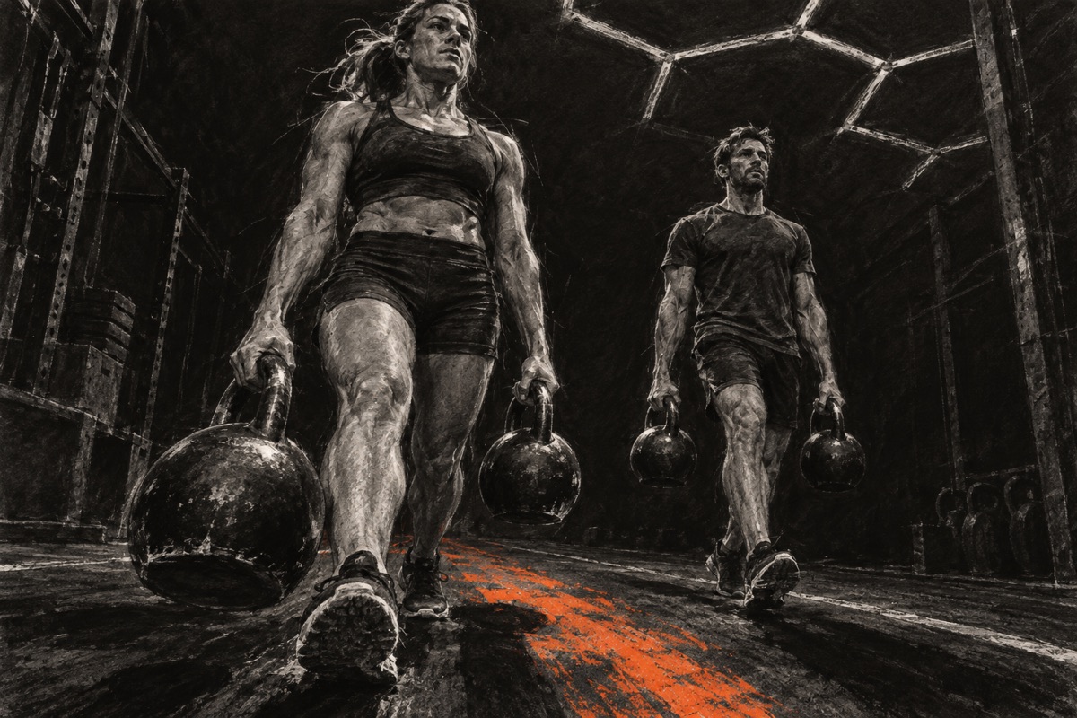
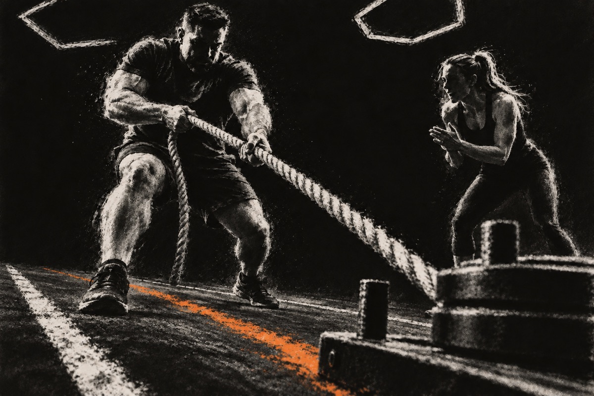
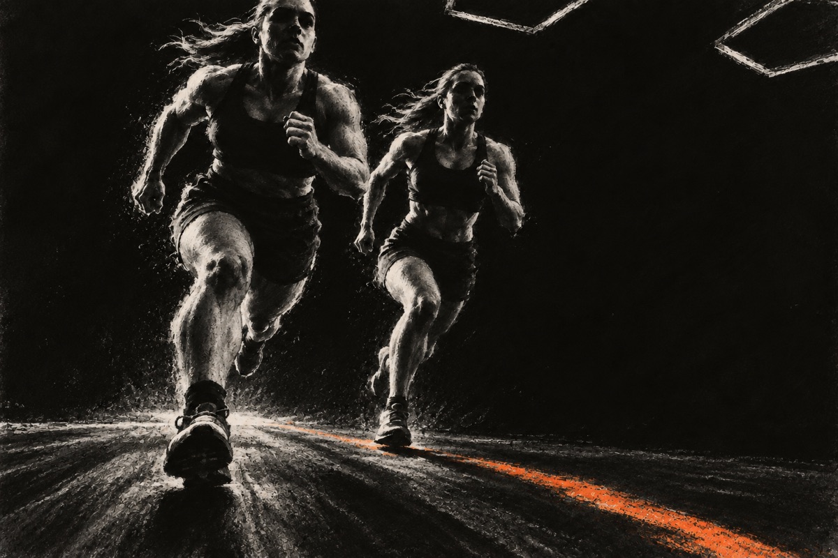
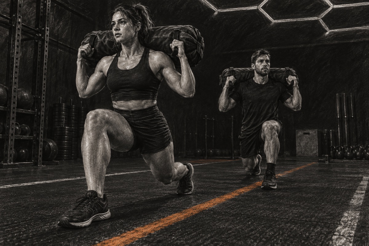
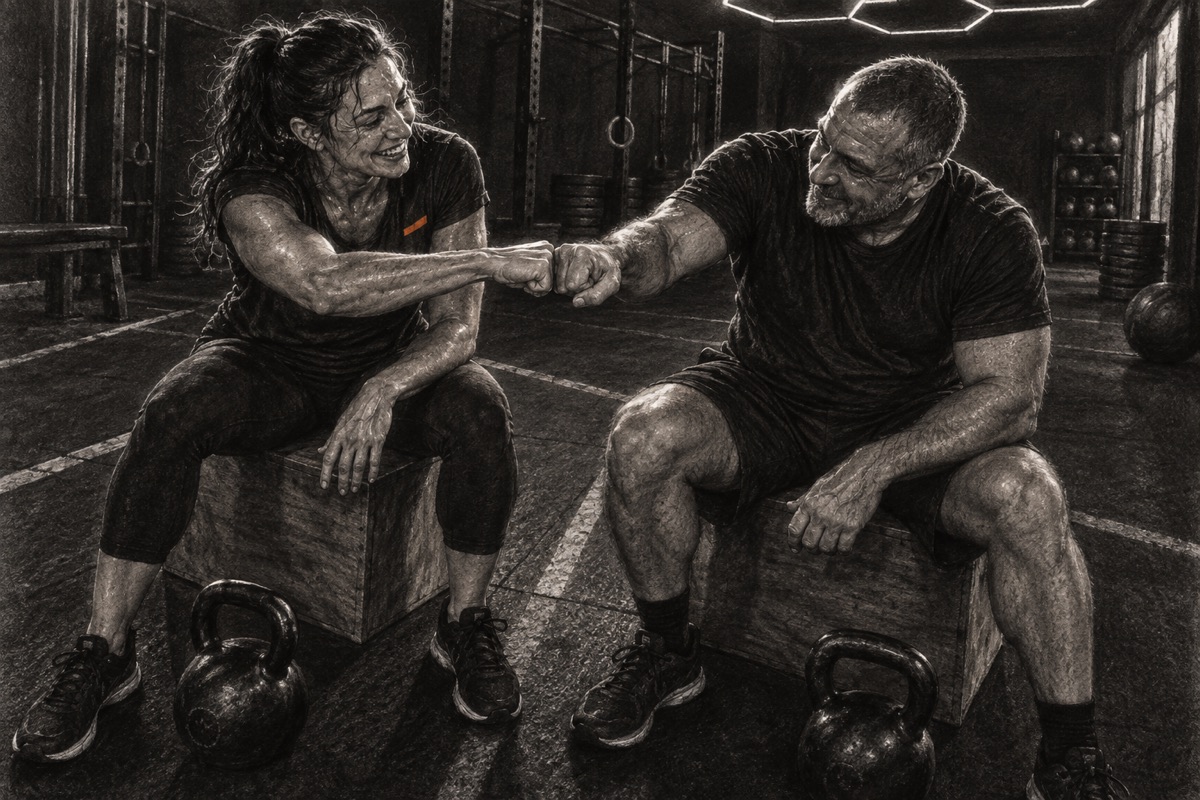
These fictional scenes show the lighting and framing to aim for.
Capture effort, concentration and recovery. Keep movement and equipment clear.
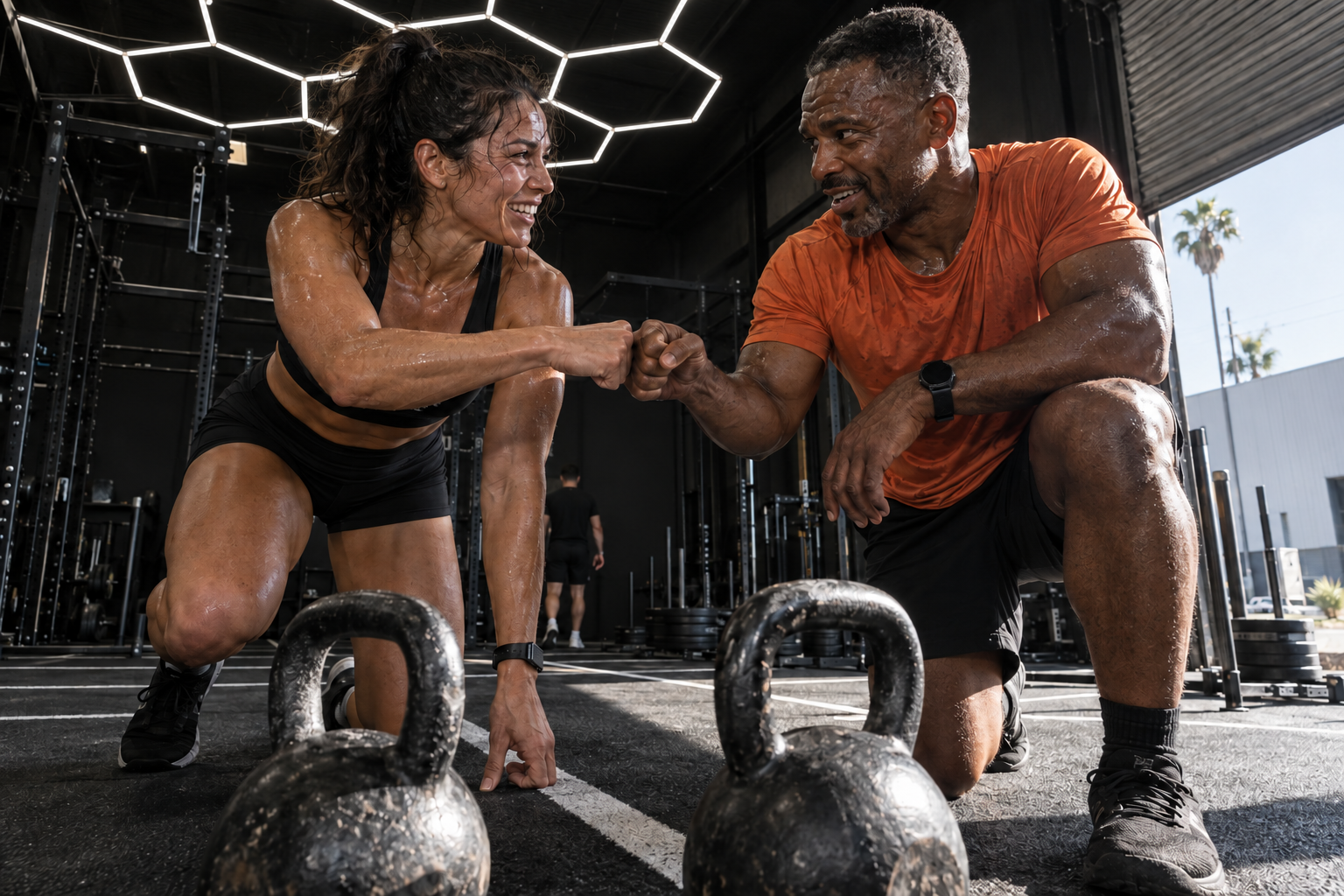
Look for coaching, encouragement and shared effort.
Use hard light and deep blacks. Keep faces, hands and the action readable.
Use real gym photos for the location. Keep fictional scenes clearly illustrative.
“Two adults carry kettlebells side by side on a marked training lane.”
“A coach demonstrates a squat stance beside a member preparing to lift.”
“Three people catch their breath together after a class.”
Use expressive charcoal for movement and detailed charcoal for quieter moments.
Keep the original texture and proportions.
Use one scene. Place text beside it or in quiet space. Keep faces, hands and equipment visible.
Keep the texture and orange accents. Add color in nearby type or backgrounds. Avoid filters, tracing and collages.
Use web JPGs online and full-size PNGs for print. Originals print at about 130 × 87 mm at 300 ppi. Ask your printer about larger uses.
Choose a treatment, replace the bracketed details and attach the matching charcoal reference. For an image edit, attach your source image first and the style reference second.
Create an original charcoal illustration of [SUBJECT AND ACTION] in [SETTING]. Use the attached charcoal image as the visual reference. Work on almost-black paper with broad, torn-edged white charcoal strokes, rubbed tonal planes, erased highlights and spare chalk dust. Build the scene from roughly 25 major marks; let large black areas remain open. Keep a precise structure beneath the loose drawing. Make hands, grips, joints and contact with the ground credible. Use a low, close viewpoint and a clear diagonal through the action. Reduce secondary figures and background objects to a few readable shapes. Add one short, dry orange pastel stroke, guided by Progress Lab orange #FF350D. Keep the rest black and white. Avoid fine muscle detail, crosshatching, photographic texture, airbrushed shading and glossy comic-book anatomy. Leave [LEFT / RIGHT / TOP] quiet for a headline added separately. Format: [ASPECT RATIO]. No lettering, logo, border or collage.
Create an original charcoal illustration of [SUBJECT AND ACTION] in [SETTING]. Use the attached charcoal image as the visual reference. Draw with white chalk and willow charcoal on almost-black textured paper. Use broad dark masses, broken contours, erased highlights and selective detail in faces, hands, clothing and equipment. Direct a hard light across the main subject; keep shadows deep and the important relationships easy to read. Show credible anatomy, natural posture and clear contact between hands and objects. Let the setting recede into black with a few useful structural lines. Add one restrained, rough orange pastel accent, guided by Progress Lab orange #FF350D. Keep the rest black and white. Avoid smooth airbrushing, glossy highlights, comic-book muscles, dense engraving and a uniform photo-filter effect. Leave [LEFT / RIGHT / TOP] quiet for a headline added separately. Format: [ASPECT RATIO]. No lettering, logo, border or collage.
Transform the FIRST attached image into a charcoal illustration using the SECOND attached image only as the visual style reference. Preserve the source composition, subject count, identities, facial features, body proportions, poses, clothing, object geometry and spatial relationships. Do not add people, equipment or scenery. Keep meaningful hands, grips and points of contact visible. Use almost-black paper, broad white chalk shapes, broken charcoal edges, rubbed shadows and erased highlights. Choose [EXPRESSIVE: sparse, forceful marks / RENDERED: selective tactile detail]. Simplify background detail without changing the place or hiding important content. Add at most one small, rough orange pastel accent, guided by #FF350D; do not recolor skin. Preserve the original aspect ratio and framing unless I specify a crop. Render it as a drawing rather than a charcoal filter on a photograph. Do not invent or redraw brand lettering or logos; leave a clean area for exact artwork to be placed afterward.
Review the result at its intended size. Check faces, hands, anatomy, equipment and contrast. Keep the original image, add exact logo and type artwork separately, and use the source file to match brand colors in the final layout.
Warm, direct and encouraging. Like a coach who wants you to do well.
Say what people need. Show them the next step. Make them feel welcome.
Give the detail someone needs now.
Repeat the heading or add filler.
Offer encouragement and a clear way to start.
Use guilt, pressure or “no excuses.”
Show people training, learning and helping each other.
Rely on vague claims about belonging.
Use natural contractions. Say “in the Lab.”
Use fitness hype or corporate language.
View memberships opens the options. Purchase [plan name] opens checkout.
Confirm success, then give the next step.
Say what went wrong and how to fix it.
Choose the right membership.
Choose a membership that fits how often you want to train.
Know where to go and what to bring.
Arrive 10–15 minutes early. Bring water and wear comfortable training clothes and shoes.
Know the action worked.
Your membership is confirmed. Choose your first class below.
Know how to fix the issue.
We couldn’t send your message. Try again or email hello@progresslabontario.com.
Find an easy way back.
We’d love to see you in the Lab. Choose a class when you’re ready.
Names the relationship clearly.
Means ongoing access.
Do not call a paid class free.
Explains the training without making promises.
Names the destination.
Says what happens next.
Welcomes people back without guilt.
BeforeUnlock your potential.
AfterCoach-led strength and hybrid training.
Say what the training is.BeforeJoin the movement.
AfterPurchase a membership.
Name the action.BeforeSubmit
AfterSend my question
Say what the form sends.BeforeInvalid email.
AfterEnter an email address like name@example.com.
Show how to fix it.BeforeDon't miss out. Get back in here.
AfterWe’d love to see you in the Lab. Choose a class when you’re ready.
Invite people back without pressure.Name the action. Show what happened. Help people keep going.
Use the same buttons, fields and values across websites and apps.
Keep transitions brief. Respect reduced-motion settings and keep content visible.
Use these examples for websites, emails, posts, clothing and signs.
Bold type, real people and a clear way to choose a membership.
View website exampleUse the editable website templates in the complete handoff.
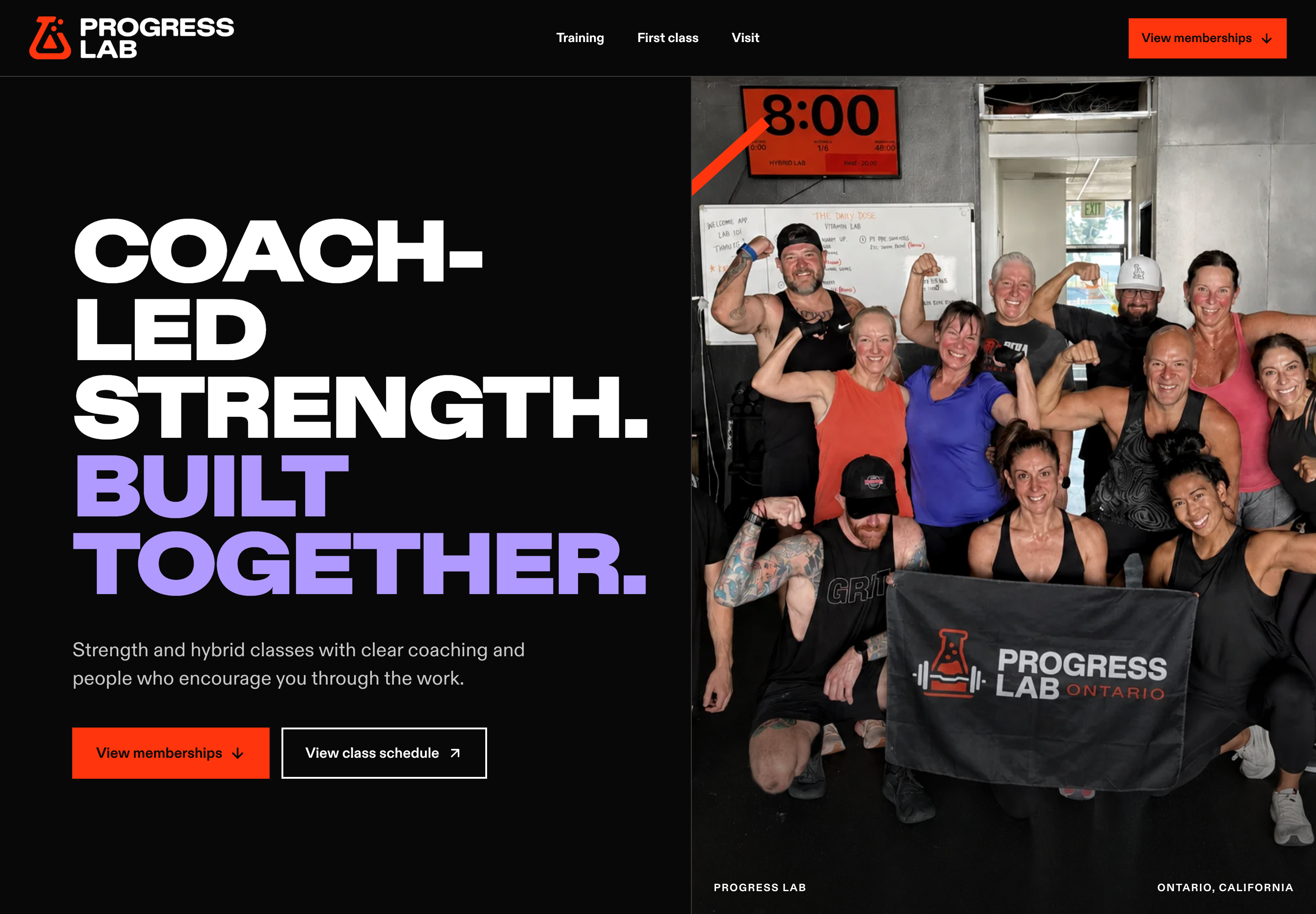
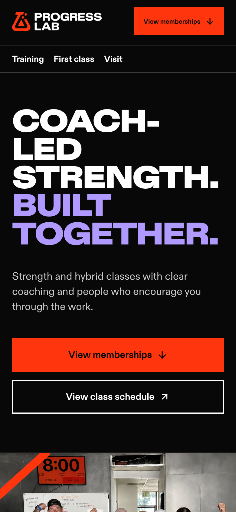
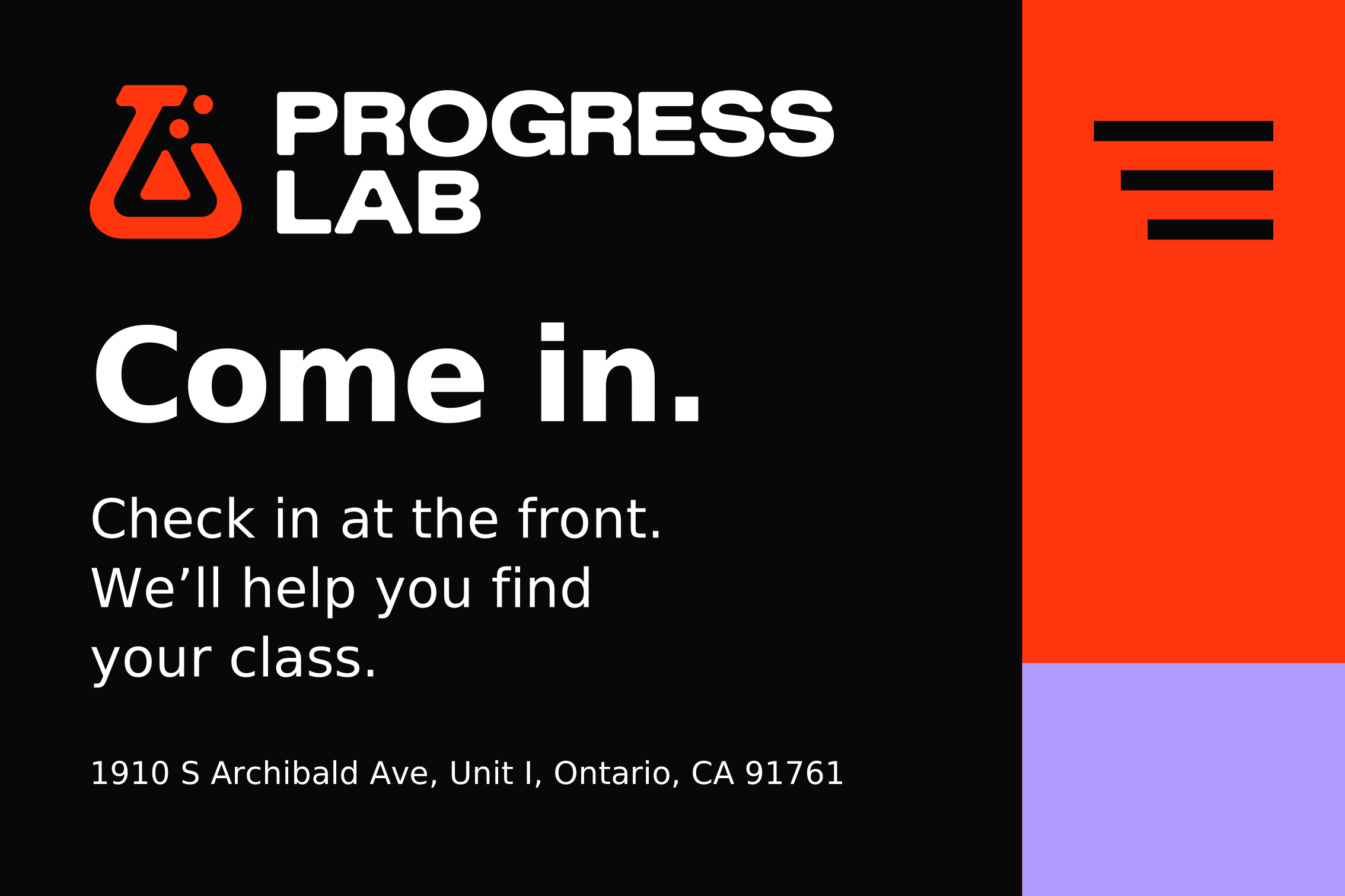
A warm welcome, useful details and one next step.
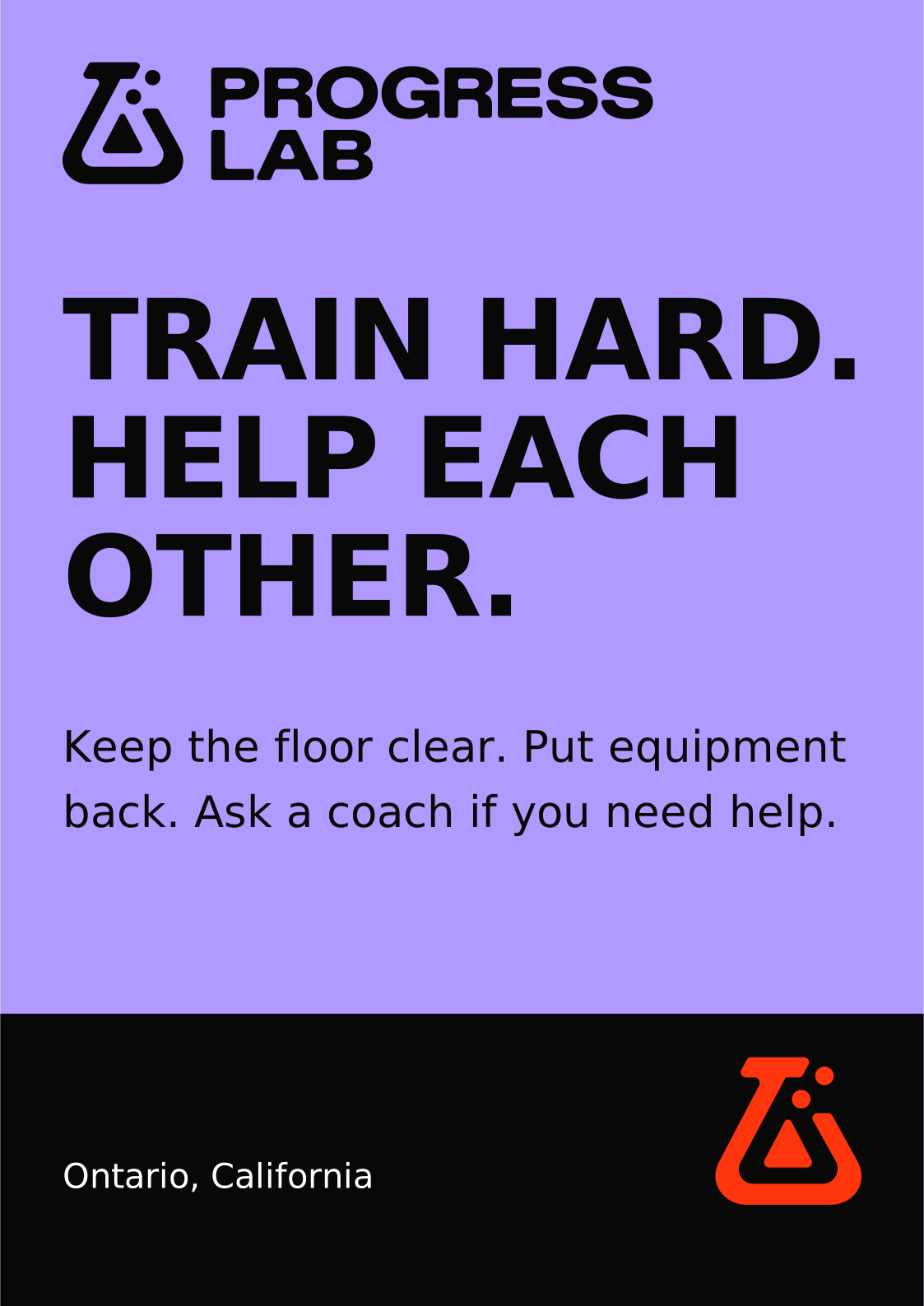
Use black, white and violet clothing. Keep signs readable at a distance.
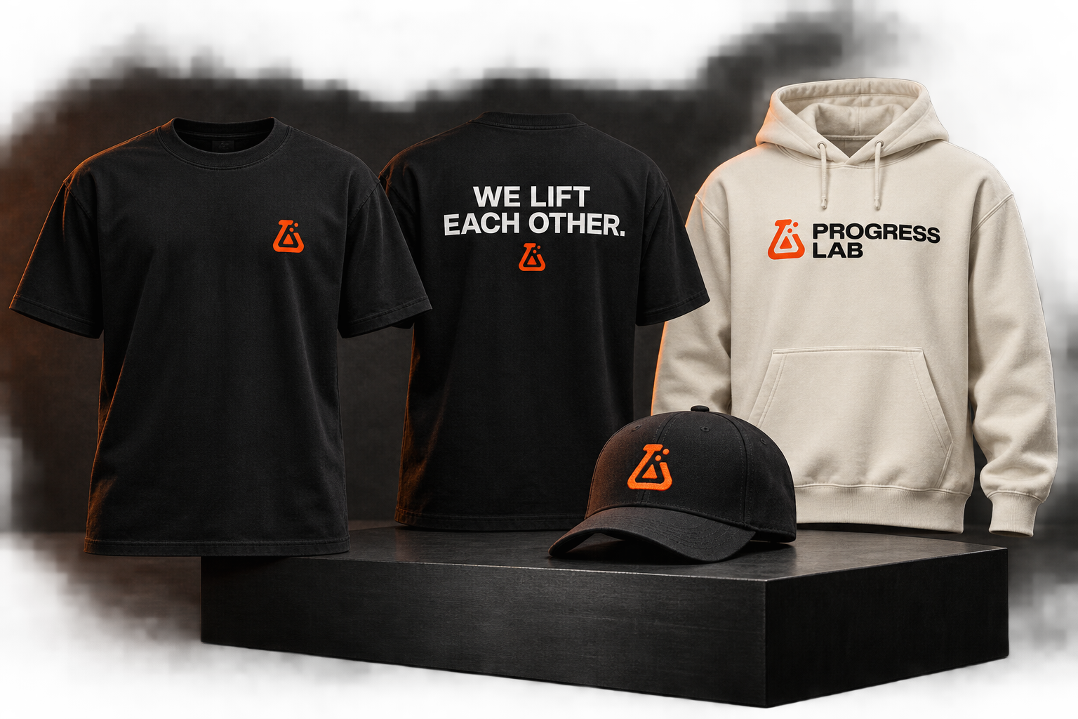
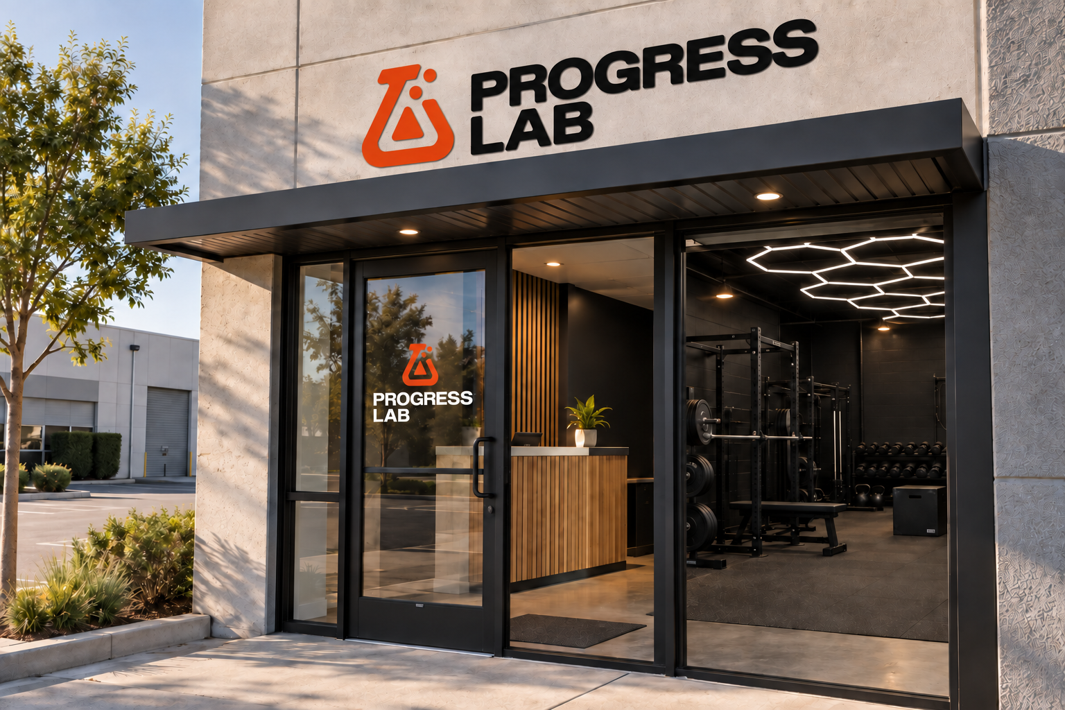
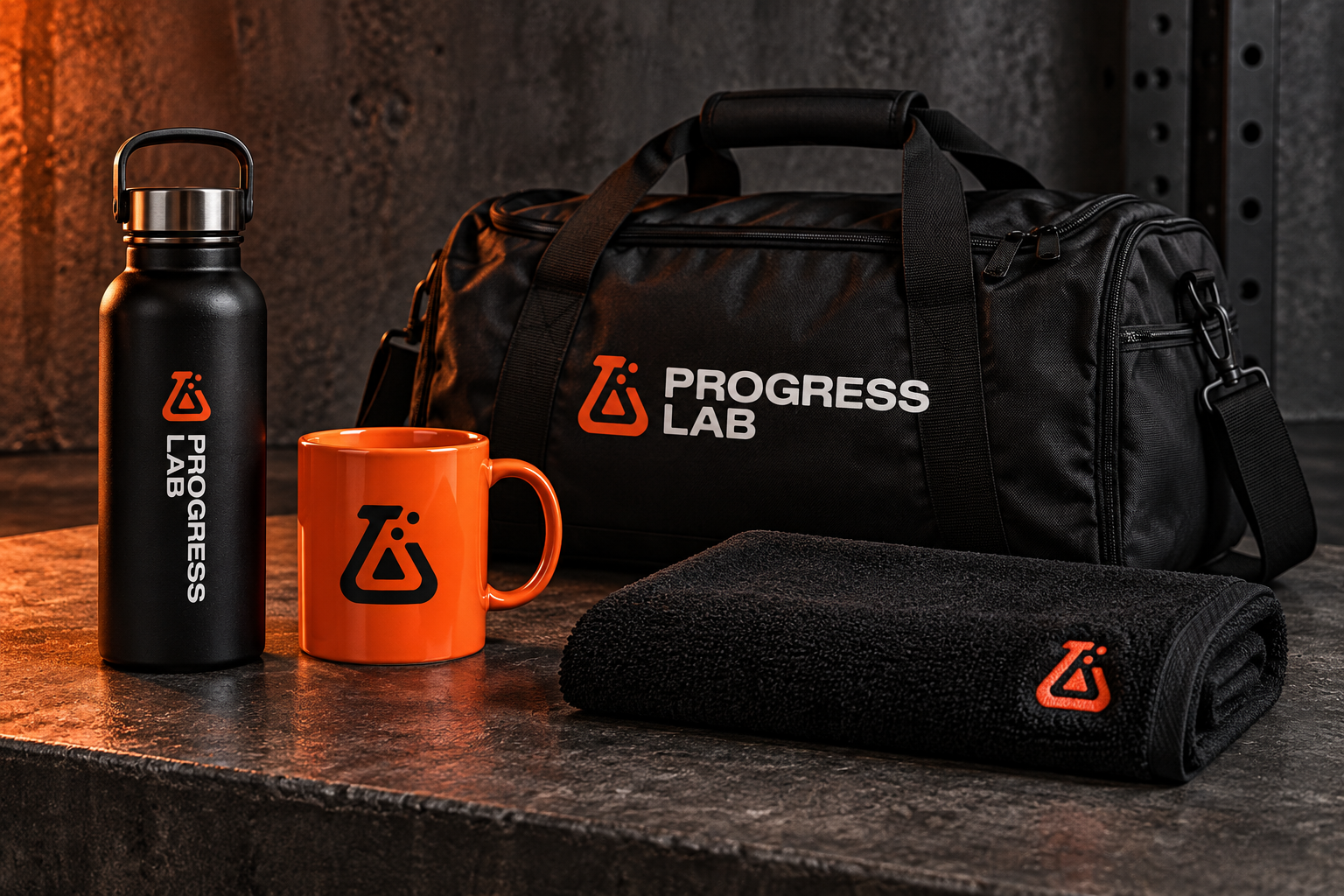
The three merchandise and entrance mockups are generated presentation concepts. They do not document actual products or site conditions. Exact production art is supplied separately.
Confirm products, printable area, ink and substrate with the vendor. Review a physical proof before manufacture.
Choose individual files or get the complete toolkit.